We will be continuing our series of insights articles on the Web Content Accessibility Guidelines by looking at the first of the criteria under the “Adaptable” guideline:
- Information, structure, and relationships conveyed through presentation can be programmatically determined, or are available in text
The real crux of this one is that we can make a screen of our application look perfectly comprehensible to a user approaching it purely visually, while a user approaching the same screen using a screen reader may find it completely incomprehensible. This might be because the meaning given to the elements of the page by its visuals (size, colour, weight, position, proximity, etc.) are no longer present.
Instead, we must provide this meaningful information either programmatically (by using the appropriate html markup) or in text (either on screen for everyone, or in attributes available to assistive tools like screen readers).
Examples of common problems and solutions
- Headings
- Problem: making some text bigger and bolder to make it look like a heading when it isn’t
- Solution: use a heading element and make sure to stick to the heading hierarchy (h1, h2, h3, etc)
- Colour
- Problem: using colour to make something stand out, or give it meaning, e.g. errors, mandatory, disabled, etc.
- Solution: in addition to colour, make use of html attributes (e.g. disabled, read-only, required), ARIA attributes (e.g. aria-invalid), or visually hidden text (see below)
- Fields and labels
- Problem: showing text above or next to an input that looks like a label when it isn’t
- Solution: use a label element with the proper relationship to the input (i.e. the ‘for’ attribute)
- Problem: showing an input that doesn’t have a label
- Solution: use aria-label or aria-labelledby
- Problem: making a set of fields appear to be grouped when they aren’t really
- Solution: use a fieldset element around the fields, with a legend (that can be visually hidden if you wish) to describe the purpose of the group
- Tables
- Problem: building something that looks like a table (e.g. using divs or space characters) when it isn’t
- Solution: use a table element and make use of all the appropriate sub-elements
- Icons without text
- Problem: showing an icon, without any text describing its meaning
- Solution: if you don’t want to show the text then add some visually hidden text or an aria-label attribute
- Custom components/widgets
- Problem: creating components common to UIs like tabs, menus, accordions, modals, etc. relies on the user recognising their visual appearance and creating an expectation of their function
- Solution: use ARIA roles and attributes to enhance your markup with information on the behaviour of the component. This can be fairly complex so find good accessible examples online to follow. For example Salesforce Lightning Design System, GOV.UK design system, inclusive components.
Visually hidden text
This technique (also referred to above) can be used for hiding html content visually while leaving it accessible to assistive technologies like screen readers. An example of how to achieve this can be found in the Bootstrap source code.
Avoid a dependency on visual presentation
The best approach is to ask yourself whether all the information required to understand the UI is completely covered by the html markup. Think of the visuals applied by your CSS as an enhancement on top of those foundations.
If you’d like to find out more, take a look at Understanding Success Criterion 1.3.1: Info and Relationships.
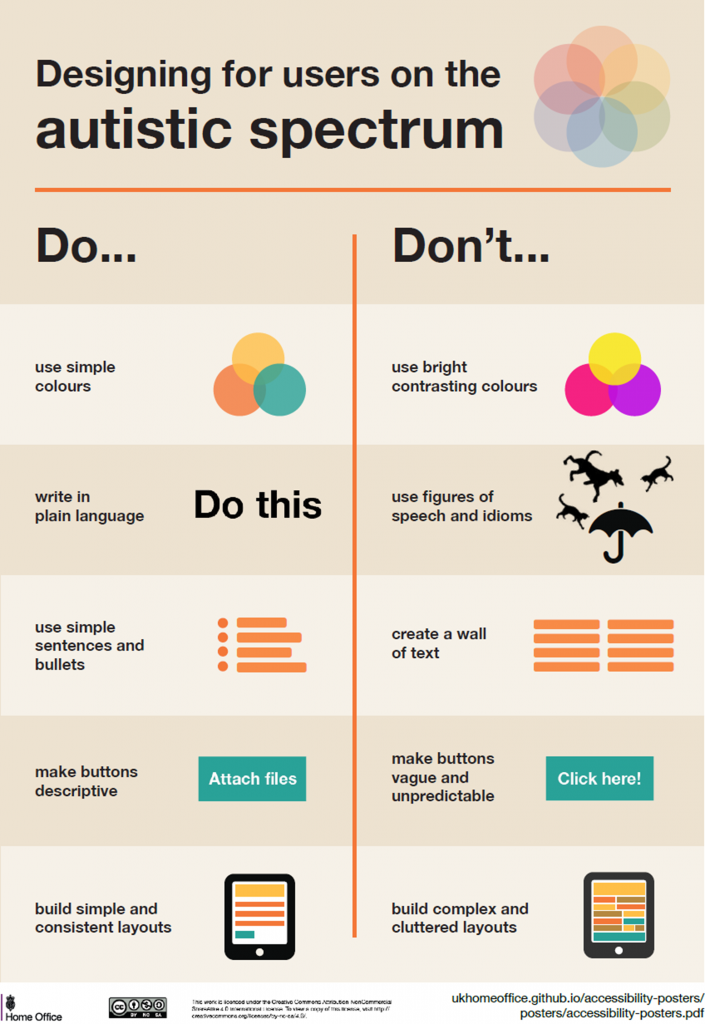
Designing for accessibility
The home office have helpfully put together some posters illustrating fundamental points to bear in mind when designing for users with particular needs. The following infographic sets out useful guidance to follow when designing for users on the autistic spectrum:
How we can help
Please do get in touch with us at info@oxfordcc.co.uk if you would like to discuss accessibility issues or requirements with us.