Resizing webpage text to increase website accessibility
In this next edition of the Website Accessibility series, we will be looking at resizing webpage text. There must be no loss of site functionality where text is resized.
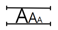
One of the criterion from the Web Content Accessibility Guidelines “Distinguishable” guidelines requires that any text displayed on your site must be capable of being resized by up to 200%, without any loss of functionality or content. There are some caveats, which we will explore in more detail below.
Zooming in the browser
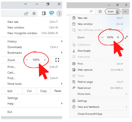
Modern browsers all include the ability to zoom, although some browsers (very old versions of Internet Explorer for example) don’t include zooming tools or only allow text size to be changed (as opposed to zooming the whole page). It is worth thinking about what browsers your users will have installed.
“Assistive technology such as screen magnifiers should not be required to assist with zooming in.”
Importantly, this criterion doesn’t apply to images of text or video/audio captions.
It is perfectly permissible for text to become truncated, provided that a user can clearly see how to view the full content. One example of this would be a table cell where the columns could be resized.
Avoiding problems with resizing text
Zooming within a browser is the equivalent of reducing the viewport width. For example, if your browser width is 1000px wide and you zoom to 200% then the effective viewport width becomes 500px. The effect will be the same as if you had resized your browser to be 500px wide at 100% zoom.
Recommendations
Using a responsive grid system can be a great help here, provided you consider how the layout would adjust when the screen width changes. You can use CSS media queries and (soon) container queries to make spot adjustments where the grid system is too basic a tool.
“The key to handling browser zoom functionality is to implement a fluid and responsive design that adjusts itself to the screen space available.”
If you need to support changes to text-size, rather than the zoom feature, you can utilise the CSS rem unit (or EM if you need to support IE 8 or below) throughout your CSS. The entire layout will then scale to match font size changes in much the same way as the browser zoom feature. You can then follow the same guidance as above.
Of course, irrespective of the approach you choose, thorough testing is essential.
Next time
Text isn’t the only thing to consider when using the browser zoom feature. Next time we will be looking at the “reflow” criterion. This relates to the need to avoid users having to scroll both horizontally and vertically to access content once zoomed in.
Find out more
If you’d like to find out more, take a look at Understanding Success Criterion 1.4.4: Resize text. There’s a lot of useful guidance there for this criterion. Follow the link here for our last accessibility article on Non-text Contrast