This article continues our series looking at website accessibility. Through these posts, we intend to provide practical tips on creating accessible software, with a focus on web applications.

This piece will focus on another criteria from the Web Content Accessibility Guidelines “Distinguishable” guideline. This criterion requires where possible, the use of real text in preference to images of text.
Why is it important?
There are many users that rely on the ability to adjust the display of text to suit their particular needs. For example: font-size, colour, spacing, alignment or even the font itself. If the text is an image, then they cannot do this, and they may struggle with the legibility of the text.
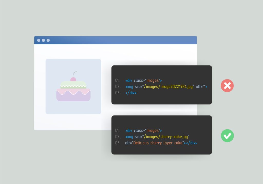
There should not be any impact on screen-reader users or even search engines if an image is used. It should have the appropriate alt-text to represent its content.
Are there any exceptions?
If it is not possible to use text to achieve the desired effect, then using an image is acceptable. An even better option is if the user can be given controls to customise the appearance of the image to suit their needs.
Some common examples of where using an image of text might be justified include logos, branding, screenshots, diagrams and graphs. However, it may be possible to find ways to use real text even within some of those examples if the tools are available to you.
Techniques to help
Our main tool here is CSS, which now includes some incredibly powerful abilities to style text in creative ways. Add in some JavaScript and there are very few limits. Just take a look at some of the inspiration on the Codrops playground.
If you find that you do need to use images of text, then you might consider a user control to switch those out for real text if the user prefers it. This could be achieved, by rendering the images as CSS background images on the real text elements and hiding the text itself. A control can then be added to apply alternate CSS that does not include the images and keeps the text visible.
Find out more
If you’d like to find out more, take a look at Understanding Success Criterion 1.4.5: Images of Text.
Author: Luke Canvin