This time we’ll be looking at the second of the criteria under the Web Content Accessibility Guidelines “Adaptable” guideline:
When the sequence in which the content is presented affects its meaning, a correct reading sequence can be programmatically determined.
As with our topic last month, the main issue we are trying to avoid here is for a screen to look perfectly fine visually, but to create problems for assistive technologies such as screen readers. This could occur where the visual order is not the same as the programmatic order, and the difference impacts the user’s understanding of the content.
We must remember that the programmatic order of content matters. It can be easy to forget this when trying to achieve a particular visual layout.
Examples of common problems and solutions
It is worth bearing in mind that the visual and programmatic sequence doesn’t have to be identical, it just needs to leave the user with the correct understanding of the meaning of the content.
- Using CSS to change the visual order of elements:
- Problem: using absolute positioning or certain properties of CSS Grid/Flexbox allows you to radically change the visual sequence of elements on a screen. That sequence will however no longer match the DOM order, so if the sequence is meaningful it might disrupt the experience for our screen reader users
- Solution: there’s no magic bullet here, you need to ensure that you test using a screen reader and that the choices you’ve made are logical
- Column/grid layouts:
- Problem: an important sub-set of the problem above – you might have content that visually flows from top to bottom of each column and then to the top of the next, but programmatically the sequence is different, for example moving left to right across columns and then back to the first column. This is most pronounced when the content is form fields. As you tab through the fields you’ll begin tabbing left to right instead of top to bottom
- Solution: change the programmatic structure of the content to match the desired flow
- Displaying a linear list of elements in a tabular format using CSS or white space characters:
- Problem: a visual user will see the headers, rows and columns but a screen reader user will just hear a jumbled list of items
- Solution: use an HTML table instead
- Using white space to control spacing within a word or line breaks between letters to make it appear vertical:
- Problem: this might have the desired visual effect, but the screen reader will probably now read out each letter individually rather than as a word
- Solution: for spacing within a word use CSS letter-spacing
- Solution: for vertical text you could rotate it (though the characters won’t be upright) or use CSS writing-mode: vertical-rl with text-orientation: upright (not supported in IE 11). If you must have vertical text with upright characters in IE 11, wrap the text in a container set to 1px wide with word-wrap: break-word
Test your meaningful sequences
The key here is to test. Make sure that all the meaningful sequences of content on your screens have the same meaning when viewed visually and read by a screen reader.
The quickest first test is to tab through your screen and see where the focus moves – does it follow a reasonably meaningful order? Use the tab stops tool in the Accessibility Insights plugin to visualise the sequence. Tabbing doesn’t catch everything though, so don’t forget to carry out a screen reader test too.
If you’d like to find out more, take a look at Understanding Success Criterion 1.3.2: Meaningful Sequence.
Everyday accessibility
The A11y Project has published an article which explores steps that all of us can take to help make our output more accessible to others. This includes tips for Word and PowerPoint documents as well as any audio/video content you might be sharing, or social media posts you might create. You can find the article here:
Everyday Accessibility. By Michele A. Williams, PhD.
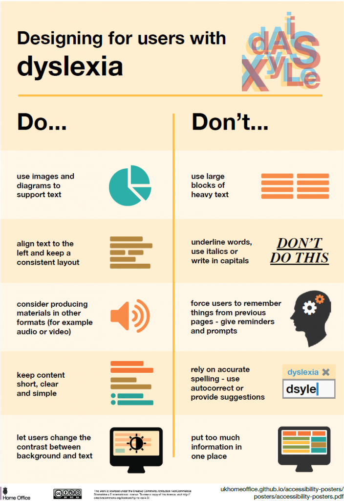
Designing for accessibility
The Home Office have put together some posters illustrating fundamental points to bear in mind when designing for users with particular needs.
We continue our series with designing for users with dyslexia.